Klarna

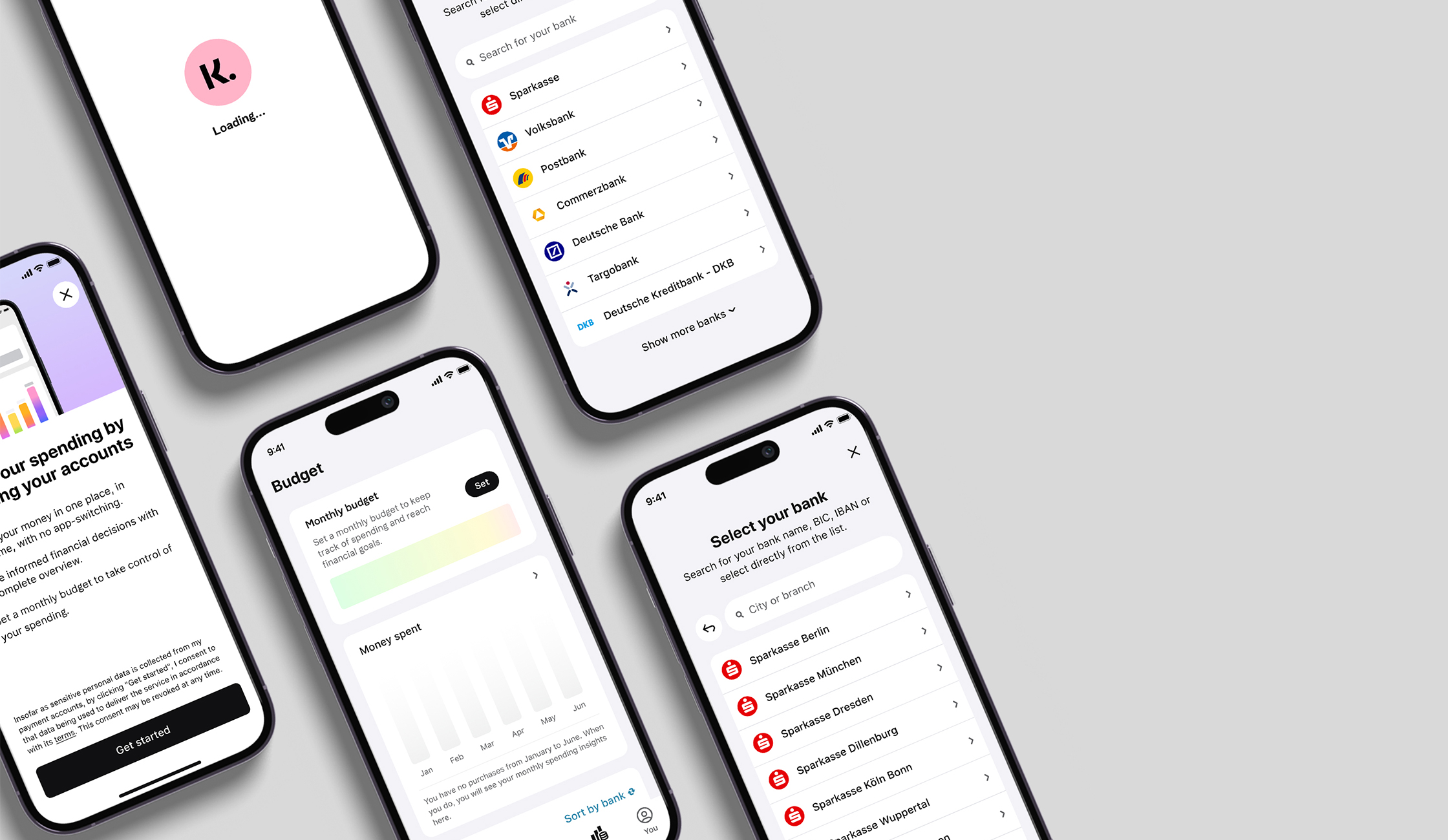
The original Sofort transfer needed a modern digital identity that conveyed both clarity and trust. The existing product appeared technically evolved and visually inconsistent, lacking a clear design language to match Klarna’s growing platform.
The Sofort ecosystem was fundamentally redesigned: from UX architecture to visual design. The challenge was to rethink an extremely established product—without losing its recognizability. Clearly structured user flows, a precise UI system, and a consistent brand language created a modern, fast, and trustworthy payment experience.
Migration into the Klarna world
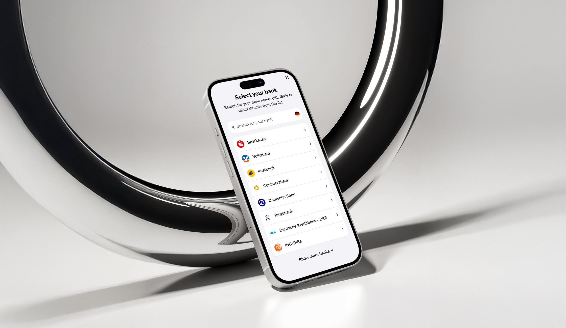
In a second phase, the product was integrated into the global Klarna design system. Based on a system that was significantly shaped and further developed, Sofort underwent a complete UI transformation: streamlined, scalable, and conversion-strong.
Scaling at high volume
With the new interface and optimized processes, Sofort became one of the strongest entry points in the entire Klarna portfolio. Millions of transactions are processed annually through the newly designed touchpoints—reliably, quickly, and seamlessly. The revised UX directly contributes to conversion optimization and higher transaction volumes.
Weitere Projekte